Simple Risk & Return Analysis/Visualization of Technology Stocks.
Summary
Was curious about how financial analysts valued assets and so as a first attempt I analyzed and visualized the stock prices of a few notable tech companies. Employed Pandas, Seaborn, and Matplotlib to graphically visualize stock ticker data analysis including prices, returns, risk and variability; Monte Carlo simulation, confidence intervals, and correlation charts were used to accomplish these tasks
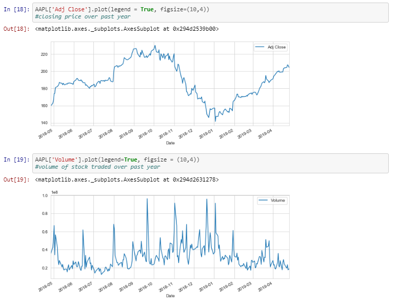
Preliminary Visualizations to see Apple's Price and Volume of stock traded over past year
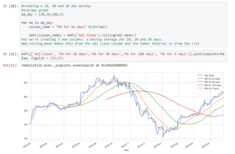
Graph for the moving average for Apple's closing price for multiple time frames
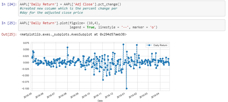
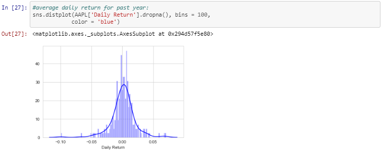
Created Daily Return column for Apple so that I could see how it changed over the years and distributions of the returns
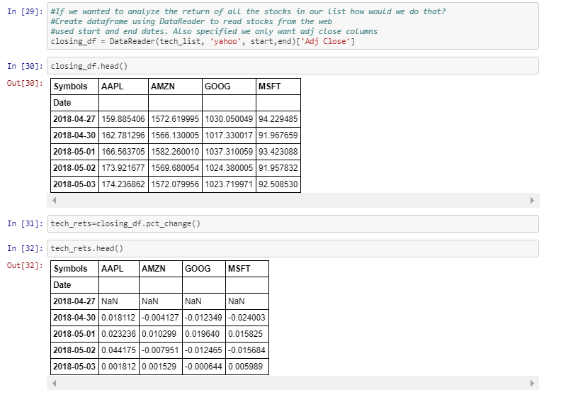
Created Daily Return dataframe for the daily returns of some of the top tech firms
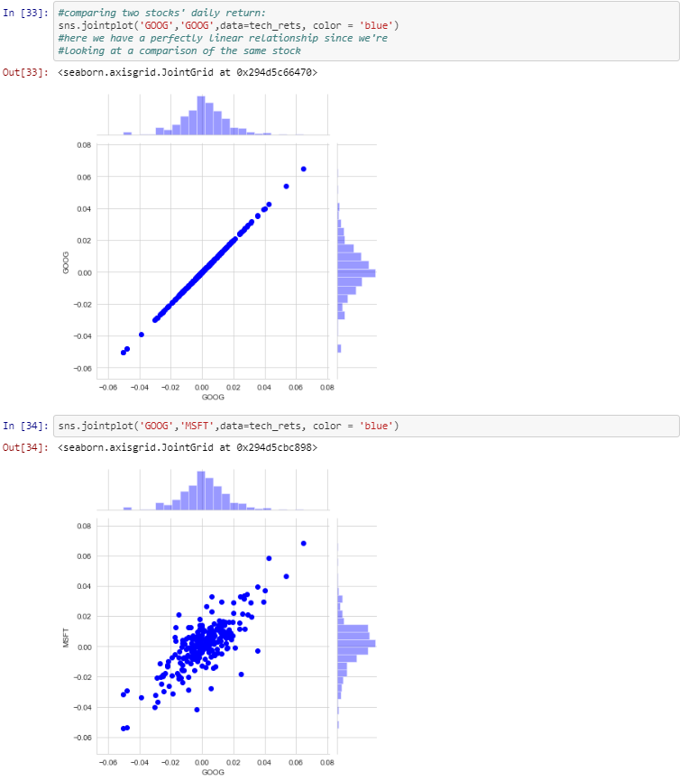
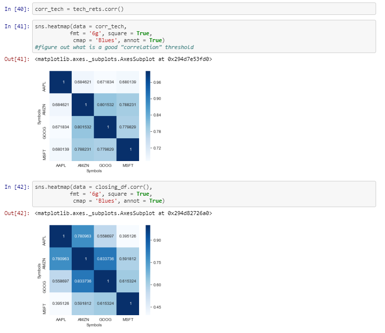
Created Correlation graphs because negatively correlated graphs can help reduce risk however these are all tech firms so they are all positively correlated
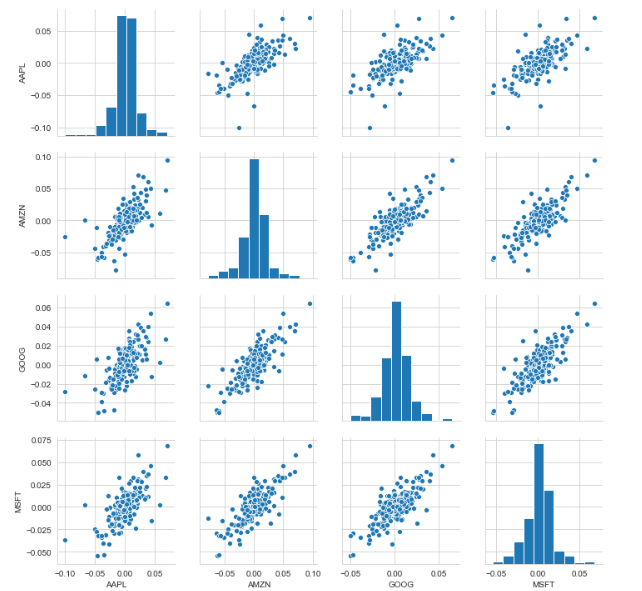
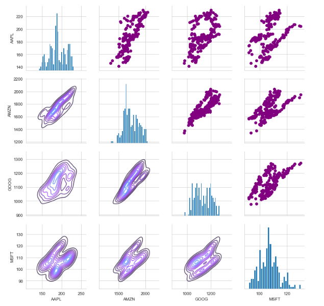
Comparing tech firms' closing prices through histograms on the diagonal, kde plots in the lower triangle and scatter plots in the upper triangle
Heatmaps of the correlations and closing prices to help identify which stocks are more correlated
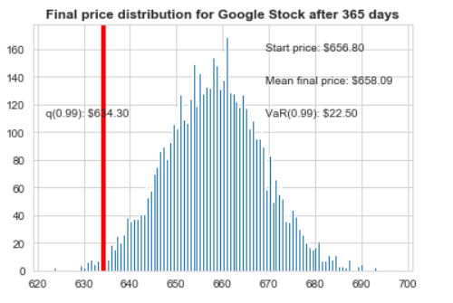
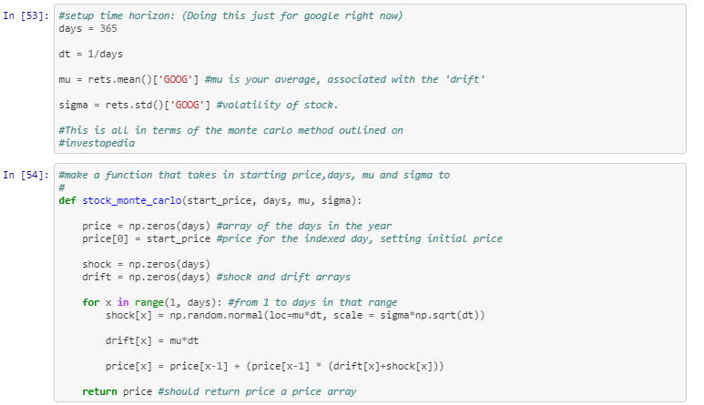
Set up for Monte Carlo Simulation
Risk Analysis using Monte Carlo Simulation
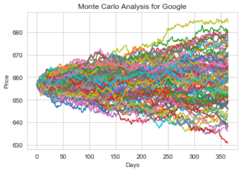
99% Confidence Interval: Given the start price we are 99% confident the price after 1 year will be $634.30